
You know that feeling when you walk into a room and instantly feel calm? Or completely off? That's not magic that's colour psychology at work.
After countless years of watching clients' faces light up (or scrunch in confusion) when I propose certain colour schemes, I've learned that colour isn't just about what looks pretty. It's about how spaces make us feel, think, and even perform.
The Science Behind the Feeling
Here's something most people don't know: your brain processes colour before it processes shape or text. In literally milliseconds, your nervous system is already reacting to the colours around you. Red increases your heart rate. Blue lowers your blood pressure. Green reduces eye strain. This isn't woo-woo stuff it's measurable, scientific fact.
I once had a client who couldn't figure out why her teenage son was so moody and sluggish in his bedroom. The walls were painted a deep, muddy brown what she called "sophisticated." Brown in large doses can actually trigger feelings of isolation and sadness. We repainted with a warm, muted sage green, and within two weeks, she texted me: he was actually doing homework in there.
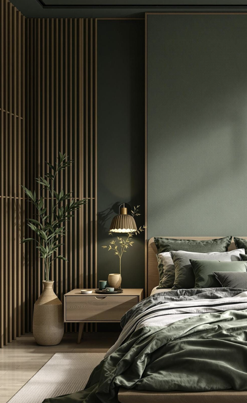
The Bedroom Trap Most People Fall Into
Your bedroom doesn't have to be beige or white to be restful. In fact, some of the most peaceful bedrooms I've designed use deeper, more saturated colours.
The key is understanding warm versus cool undertones. A bedroom painted in a cool grey with blue undertones can actually feel sterile and unwelcoming. But that same grey with warm, slightly purple undertones? Pure sanctuary. The difference is subtle to the eye but profound to your nervous system.
I always tell clients to test their bedroom colours at different times of day. That "perfect" blue might look serene at noon but feel cold and uninviting at 9pm when you're trying to wind down.
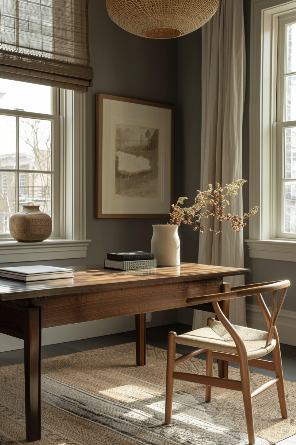
Your Home Office Colour is Sabotaging Your Productivity
If your home office is painted white because it's "neutral," you're actually working against yourself. Pure white can cause eye strain and mental fatigue.
Colours that actually boost productivity:
- Soft yellow stimulates creativity and optimism without being overwhelming. Think warm butter, not screaming school bus.
- Muted green reduces eye strain and promotes focus.
- Warm grey with beige undertones provides calm focus without the sterility of cool greys.
The Restaurant Trick You Can Use at Home
Ever notice how fast-food restaurants use red and yellow, while upscale restaurants favour deep blues and purples? Red and yellow stimulate appetite and create urgency, while blues and purples slow down eating and encourage lingering.
In your dining room, warm colours like terracotta, deep gold, or rich burgundy create intimacy and stimulate conversation. Cool colours work better in kitchens where you want to feel energised and efficient.
The Two-Colour Rule That Never Fails
When in doubt, use this formula: choose one warm colour and one cool colour, then use them in different proportions throughout your space. Maybe it's a warm beige with cool blue accents, or a cool grey with warm wood tones.
The secret is in the proportions: 60% of your dominant colour, 30% of your secondary colour, and 10% accent colours for personality.
Testing Colours Like a Pro
Paint those sample squares bigger than you think you need. Look at them in morning light, afternoon light, and evening light. Live with them for at least a week before deciding.
And here's a pro tip: paint your samples on opposite walls. Colours can look completely different depending on which direction they're facing.
Colour psychology isn't about following strict rules. It's about understanding how different hues can support the life you want to live in each space. When you get it right, your home doesn't just look beautiful. It feels like it's working with you, not against you.