
You've arranged and rearranged. You've bought new throw pillows. You even splurged on that expensive rug. But something still feels... wrong.
Nine times out of ten, the problem isn't what you chose. It's how it all relates to each other. Proportion is the invisible force that makes spaces feel either harmonious or chaotic, and most people are unknowingly fighting against it every day.
Mistake #1: The Floating Furniture Syndrome
Walk into most living rooms, and you'll see the same scene: a sofa floating in the middle of the room like a lonely island, with a coffee table that could double as a postage stamp sitting sadly in front of it.
Here's the thing about furniture placement that nobody talks about: your brain craves connection. When furniture pieces look like they're trying to escape from each other, your subconscious picks up on that tension.
The fix is simpler than you think. Your coffee table should be about two-thirds the length of your sofa, not half. And that gap between sofa and coffee table? It should be close enough to easily reach your drink, far enough to stretch your legs.
I once had a client with a gorgeous sofa that somehow made her living room feel cramped. The culprit? A tiny round coffee table that looked like it was cowering in the corner. We replaced it with an oversized rectangular ottoman, and suddenly the whole room exhaled.
Mistake #2: Art That's Afraid of Heights
This one makes me cringe every time: beautiful artwork hung so high it might as well be ceiling decoration. There's this persistent myth that art should be hung at "eye level," but whose eye level?
The centre point of the artwork should be roughly 150cm from the ground. This works in 90% of spaces because it's based on average human eye level.
But here's where it gets interesting: size matters more than you think. That 16x20 print that looked perfect in the store? It's probably too small for the wall you have planned. Most people need to go at least 50% larger than their first instinct. For artwork above a sofa, aim for pieces that are 60-75% of the sofa's width.
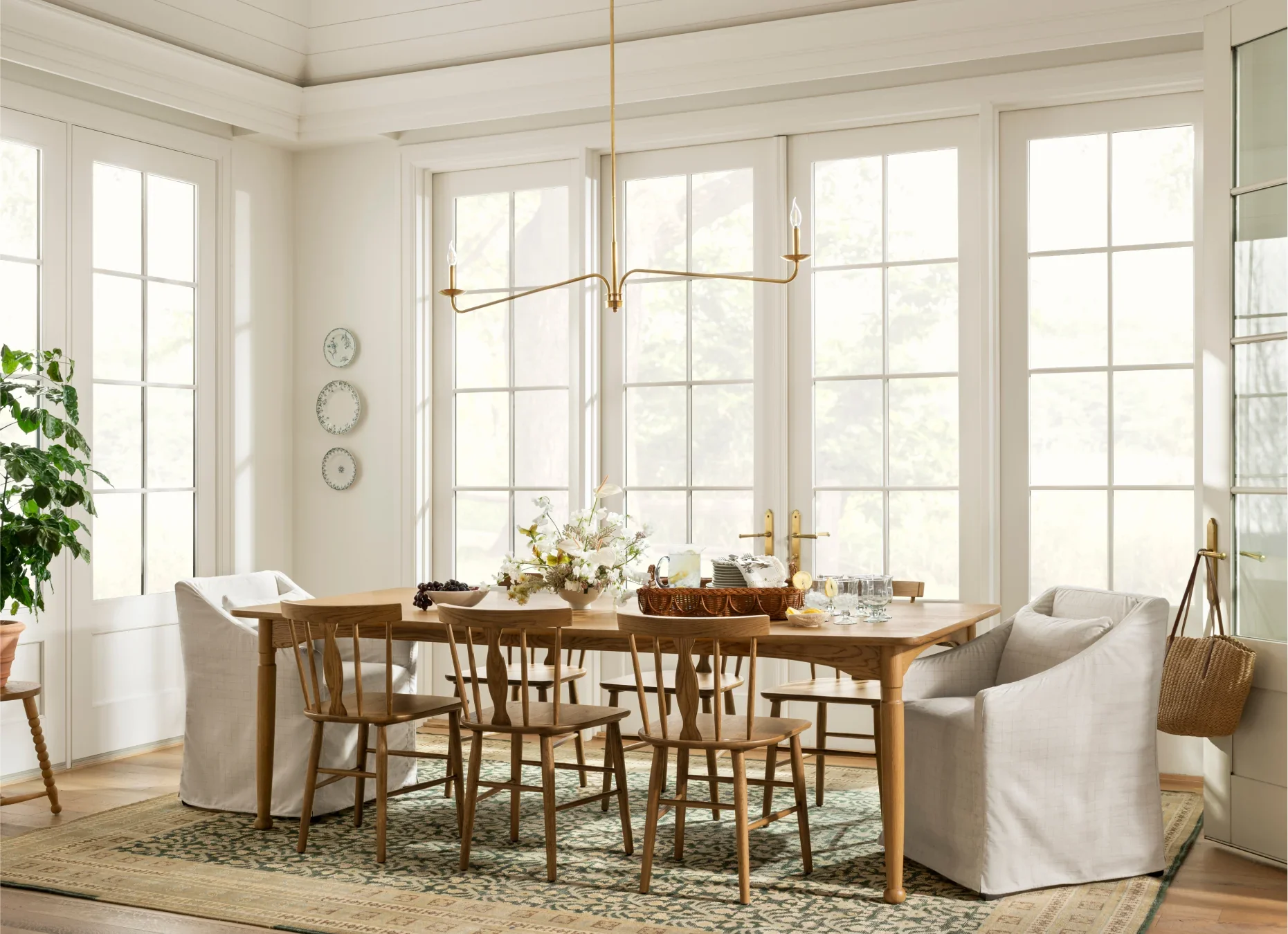
Mistake #3: The Rug That Gave Up
Nothing makes a room look more unfinished than a rug that's too small. In living rooms, your rug should be large enough for at least the front legs of all your furniture to sit on it. Ideally, all four legs of your main seating pieces should fit.
The most common rug sizes people think they need versus what they actually need:
- What they buy: 5x8 rug for a living room
- What they need: 8x10 or 9x12 rug
In dining rooms, your rug should extend beyond your table on all sides so that when people pull out chairs, they're still on the rug.
Mistake #4: The Scale Confusion Crisis
You can have beautiful individual pieces that create a chaotic mess when combined. The secret is understanding visual weight, not just physical size. A delicate glass coffee table has less visual weight than a chunky wooden one, even if they're the same dimensions.
I use the "squint test" with clients. Squint at your room until everything gets blurry. What you're seeing now is the balance of visual weight. Are there heavy, dark masses all on one side? Is everything feeling too light and floating? This helps you see what needs to be adjusted.
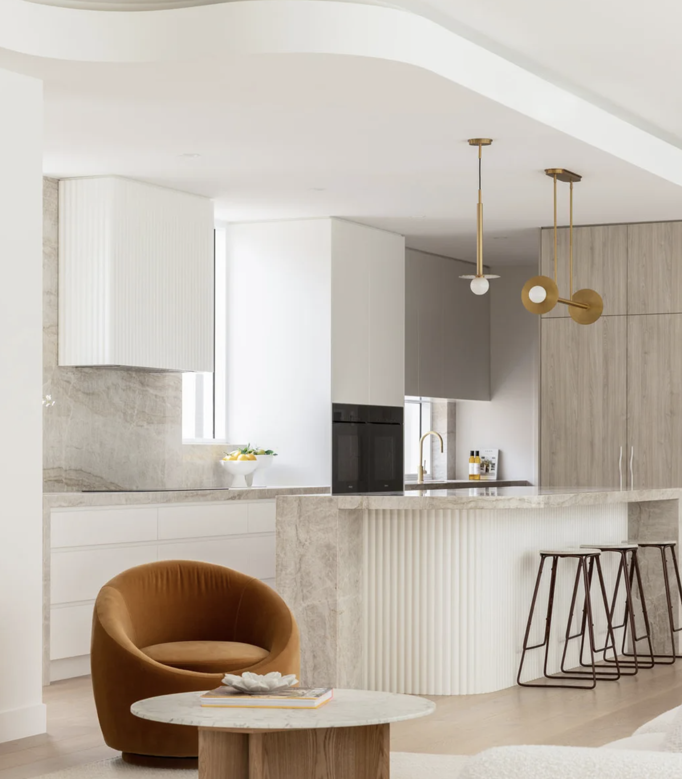
Mistake #5: The Lighting Height Horror Show
Pendant lights over kitchen islands hung at random heights. Chandeliers that either knock you out or disappear into the ceiling. Every light fixture has an ideal height, and these measurements aren't suggestions they're based on function and proportion:
- Pendant lights over islands: 75-90cm above the surface
- Chandeliers in dining rooms: 80cm above the table
- Bedside table lamps: Lamp bottom at mattress level, shade at eye level when sitting up
One of my favourite transformations involved simply adjusting the height of a client's dining room chandelier. It had been hung so high it was basically decorating the ceiling. Lowering it by 45cm transformed the entire room from a cafeteria-like space into an intimate dining experience.
The Fix That Changes Everything
Start with your largest piece usually the sofa and build everything else in relationship to it. Don't choose pieces in isolation. Remember: good proportion isn't about following rigid rules. It's about creating relationships between objects that feel harmonious and intentional. When you get it right, you stop noticing the individual pieces and start experiencing the room as a cohesive whole.
And that "off" feeling? It disappears completely.